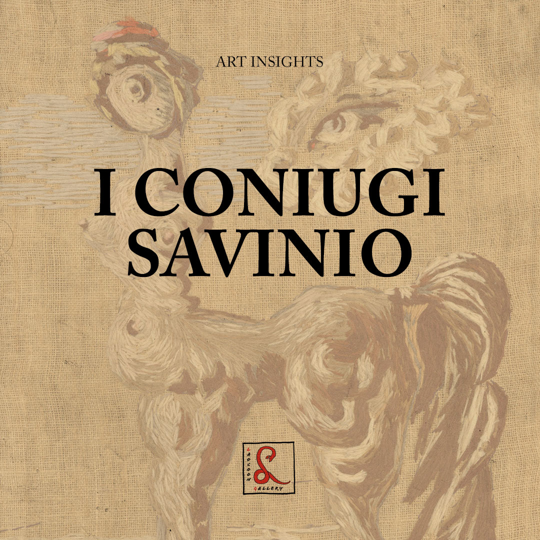
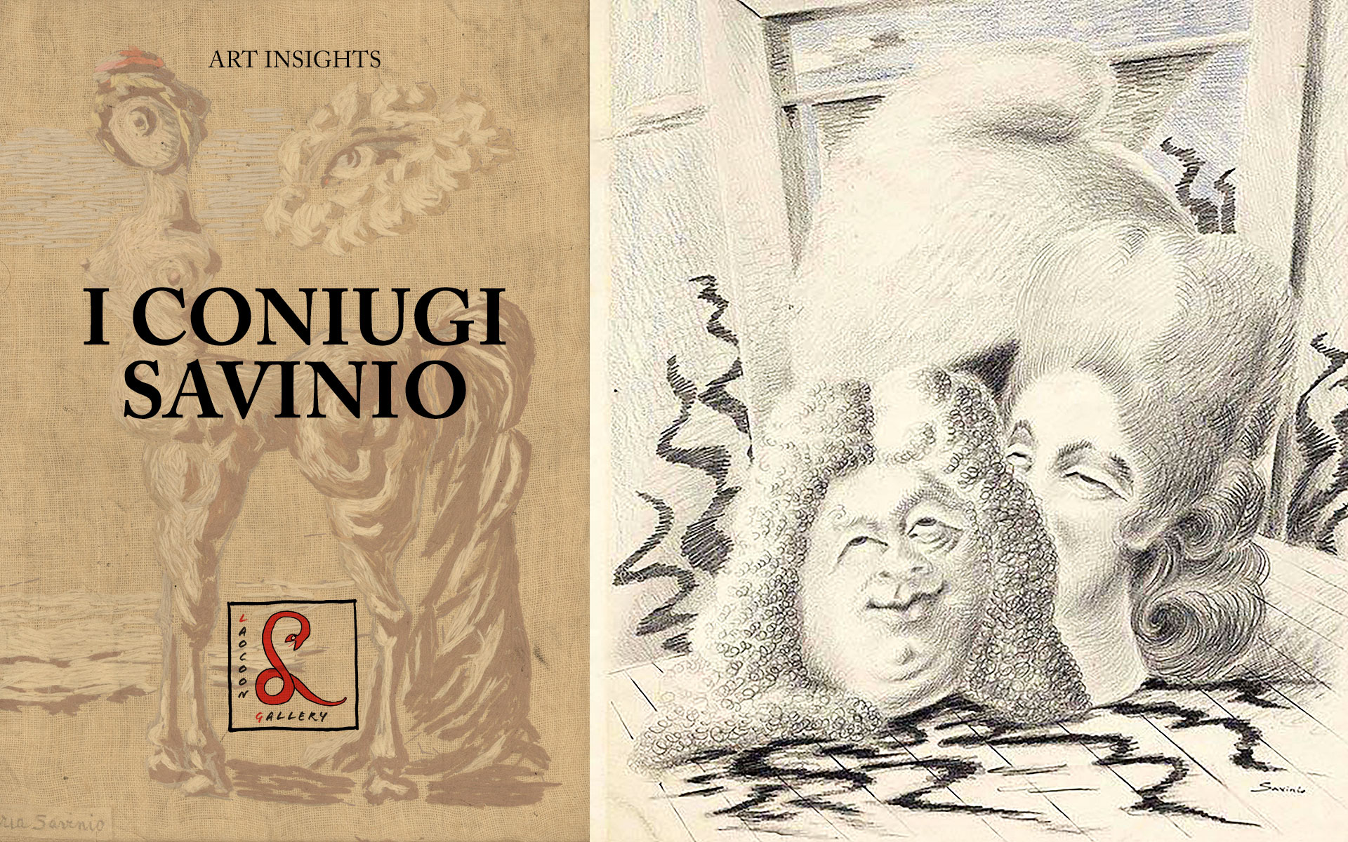
Publio Morbiducci, Male Nudes
Publio Morbiducci, Male Nudes
Publio Morbiducci is a Roman artist who showed the same mastery as a painter, xylographer, medalist and sculptor of monumental works. His works are known by most as familiar with the urban landscape of Rome, even if the author’s name may escape them. Who doesn’t know that in front of Porta Pia lies the Monument to the Bersagliere? Who in the EUR district of Rome can ignore the Dioscuri couple and their soaring travertine horses which rear their heads to a height of over seven metres? Both are the work of Publio Morbiducci, an ancient Roman name which contrasts ironically with the hard masses of Tiburtine stone and Apuan marble that the sculptor’s chisel laboriously carved during his lifetime given that the direct translation of morbido is soft. He made his artistic debut as a painter, one of the most extraordinary among those of the Roman Secession, which took place on the eve of the First World War, equal in expressionistic intensity to the greatest artists in European painting of the time. But this extraordinary debut was soon abandoned due to the influence of his master Duilio Cambellotti, who convinced Morbiducci to follow the path of tradition, devoting himself to xylography and medals, then seen as ancillary arts to painting and sculpture, which at that time were inspired by the synthetic and classic forms of ancient Italian Renaissance tradition. The medals, minted for events of all kinds – aeronautical records, cruises, fairs, public works – were an integral part of the fascist regime’s propaganda, and it was with these that Morbiducci achieved unquestionable perfection.
 As far as monumental sculpture is concerned, he was entrusted with the commission for the Italian Pavilion at the Universal Exhibition of New York in 1939, this included the Golden Fascist Italy which was prominent on the facade of the building and celebrated the achievements of the regime as well as predicting future glories (that would never be realised). He was also commissioned to create the bas-relief at the entrance to Palazzo Uffici for E42, the Rome Universal Exhibition, competing to overcome in magnificence a New York exhibition which had coincided with the outbreak of the Second World War. It was in the same triumphalist and celebratory style, in anticipation of future Olympics that would ultimately not take place until much later, that the Foro Italico was built, a set of sports complexes and monumental spaces which included the Stadio dei Marmi and the Stadio del Tennis: comprising sixty-four statues of athletes at the former and eighteen at the latter, each four meters high, each paid for by a province of Italy. All were in Carrara marble, as the complex was designed by Renato Ricci, a politician from Carrara who was also president of the Opera Nazionale Balilla. Ricci cared more about the miners and carvers of Carrara than the quarry owners, who would end up in the hands of the banks after the crisis of 1929.
On paper Morbiducci’s only work at the complex was Discobolo in riposo, one of the last statues to be placed in the Stadio dei Marmi, in 1938, a full six years after its official inauguration and in conjunction with the decennial of fascism. In reality he had participated in the initial competition, in which sculptors from all regions of Italy submitted 127 sketches, but his most significant involvement was with the creation of the statues originally commissioned to Eugenio Baroni (1880-1935) – one fisherman with a harpoon and the other with a net, for the Tennis Stadium, works for which it could be said that he was both heir and executor of the will. Indeed, it was also Morbiducci who built the Monument to the Duke of Aosta at Piazza Castello in Turin, for which Baroni had won the competition but could not finish the works because he fell morbidly ill, leaving the baton to Morbiducci before his death.
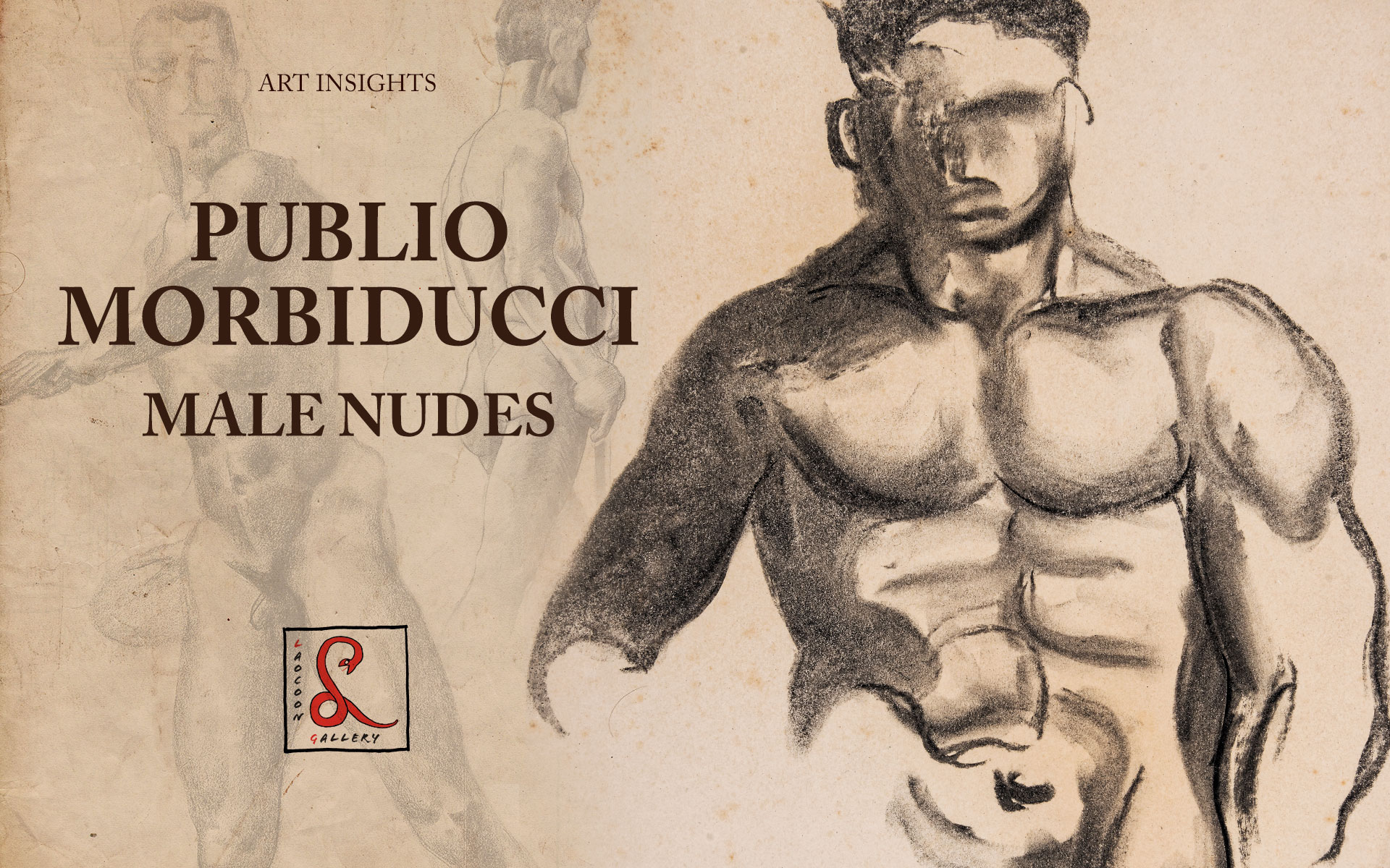
As a result of these great assignments, Morbiducci spent the vast majority of the thirties drawing bodies in athletic poses, looking for that synthesis between real and ideal which had been the ancient and distant secret of Greek beauty, where victorious athletes, real people with a name and a homeland, had been transfigured by art into idealistic archetypes, and had subsequently become a synthesis of impersonal, youthful beauty. As models he would either use his nephew or people from the squares of the Testaccio close to his studio. These bodies were strengthened by the physical nature of their jobs, from unloading boxes for the market to labouring at the workshop, rather than by the gymnastic exercises of the Olympians. In short, they are quintessentially Italian. Almost all of the bronze originals have been lost, and along with them the names of the athletes depicted, the year of their victory and their city of origin, which were once inscribed on the pedestal of each statue. It is only as a result of them having been copied in marble to satisfy the artistic ambitions of the Roman conquerors that they were preserved for current generations, perpetuating the Greek ideal until the 20th century Olympics. In pencil and charcoal Morbiducci works to transform the individuality of his models into perfect forms, in search of an Italian beauty that is always tempered by the classical ideal.

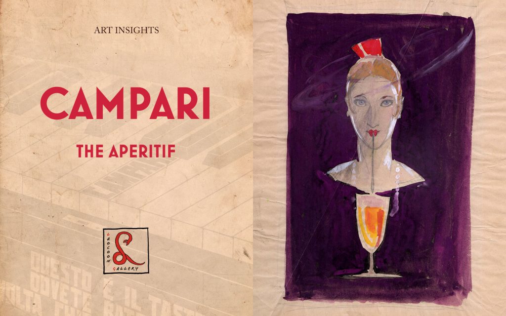 The unique relationship between Fortunato Depero and Davide Campari, owner of the Campari Group, began in 1924-25 and would yield its first public showing at the 1926 Venice Biennale through the exhibition of large oil painting Squisito al Seltz, Quadro Pubblicitario – Non cartello. The work depicted two customers at the bar under the sign ‘Campari’. From that moment on the artist created a great number of sketches for posters, typographic alerts and advertising sculptures. Through these adverts Davide Campari partly financed the famous “bolt-bound” book entitled Depero Futurista in 1927 and also facilitated the departure of the artist to New York in 1928. Upon his return to Italy in 1931, Depero published ‘Numero Unico Futurista Campari’ in which also appeared his extraordinary design for an exhibition pavilion for the company, with the letters of the brand Campari, Bitter and Cordial forming an integral part of the proposed structure. In 1932 Depero would design the famous conical bottle, in printed glass without a label, with which the new product called Campari Soda was launched. This piece is the first idea for a black and white advert that was published in newspapers and magazines with the addition of the writing “Evviva!”. The elemental male, typical of Depero’s style, forms with his arms and legs the shape of an X, a form which is echoed in the hourglass shape of a chalice formed by two cones. It was from this upside-down chalice shape that Depero would conceive his design for the bottle of Campari Soda. Here, at the centre of the joyous man is cut a heart, white like the contents of the glass, showing the affectionate relationship between man and liquor. It was not by chance that, when the artist repeated the composition, this time as a coloured preparatory collage for a poster never made, he assigned it to the Cordial and not the Bitter, choosing the same colour for both the heart and cordial out of semantic respect for the fact that the two names derive from each other.

 The exhibition assembled a number of preparatory pieces for the frescoes which included drawings, sketches, oil on panel and cartoons, all precursory to the monumental lost works of the artist. This nucleus, significantly brought together by curators Marco Fabio Apolloni and Monica Cardarelli, is the last surviving testimony of the murals that occupied two rooms, the Bread Hall and the Family Hall, of the monumental 14th century Castle of the Grand Master of the Knights in Rhodes, which was rebuilt by the Italians between 1936 and 1940 following its devastation by an ammunition explosion in 1856.