Campari
CAMPARI
In 1860, the experiments of passionate liquorist Gaspare Campari culminated with the invention of a striking new red beverage with a distinctive bitter flavour and a secret recipe. The aperitive was called Campari, and following great success in the coming years a close relationship was forged between the company and prominent artists of the early twentieth century. From that moment on the greatest artists of the period have contributed to the brand, expressing the soul of Campari with their artworks.
The first work under the spotlight this week features an elegant female figure dressed in Turkish garments on a dark background. She has been drawn by the artist with confident strokes which are characteristic of consummate expertise in both graphics and women’s fashion, with a turban on her head and a wide band around her waist to keep the ample fabric of her robe in place. The tempera, which has been heavily diluted, is applied with light brushstrokes to the figure. The light and dark yellow, the green and red together with the hue of the white lead, used to generate the effect of light coming from the left, enrich and elevate the pencil drawn model. The Turkish woman is caught in the act of spritzing seltzer water into a chalice containing an orange drink, which brings to mind the beverage invented in 1919 by the Barbieri brothers, Silvio and Luigi, and later subsumed by Campari Group, known as Aperol Spritz. Since its birth the orange colour has been Aperol’s chromatic signature, and even if the marketing materials have changed considerably, with provocative women taking the place of those elegant and moderate female figures employed to advertise the brand in the 1950s, the same orange colour continues to identify this drink. The identification of the liquid as Aperol remains in any case a hypothesis, even if plausible, due to the lack of an inscription on the sketch stating the brand of the product.
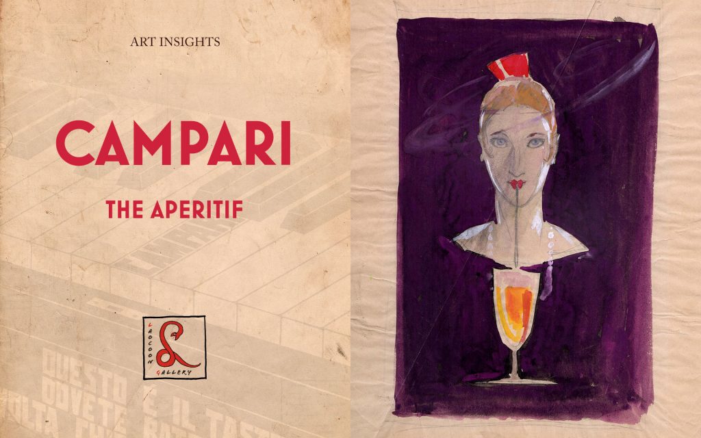
The second piece we focus on is similar to the first not only in its dark violet background, with heavily diluted tempera, but also and most importantly for the presence of the same chalice filled with the orange liquid. At the centre of the sheet lies a beautiful female face, framed by touches of white lead which brighten up and enhance her contours. Her blond hair is styled in the fashion of the Roaring Twenties, with charming lovelocks curled on the cheekbones and a wide comb of an intense orange colour. This is probably the peineta, a typical Spanish female ornament which was used by many divas of the time like Paola Negri, companion of Rodolfo Valentino, who excelled at playing the role of the gypsy and of the Andalusian. With her pretty orange mouth in the shape of a heart, Brunelleschi’s figure drinks with a straw the beverage from a chalice whilst floating in the darkness of the paper.
 The unique relationship between Fortunato Depero and Davide Campari, owner of the Campari Group, began in 1924-25 and would yield its first public showing at the 1926 Venice Biennale through the exhibition of large oil painting Squisito al Seltz, Quadro Pubblicitario – Non cartello. The work depicted two customers at the bar under the sign ‘Campari’. From that moment on the artist created a great number of sketches for posters, typographic alerts and advertising sculptures. Through these adverts Davide Campari partly financed the famous “bolt-bound” book entitled Depero Futurista in 1927 and also facilitated the departure of the artist to New York in 1928. Upon his return to Italy in 1931, Depero published ‘Numero Unico Futurista Campari’ in which also appeared his extraordinary design for an exhibition pavilion for the company, with the letters of the brand Campari, Bitter and Cordial forming an integral part of the proposed structure. In 1932 Depero would design the famous conical bottle, in printed glass without a label, with which the new product called Campari Soda was launched. This piece is the first idea for a black and white advert that was published in newspapers and magazines with the addition of the writing “Evviva!”. The elemental male, typical of Depero’s style, forms with his arms and legs the shape of an X, a form which is echoed in the hourglass shape of a chalice formed by two cones. It was from this upside-down chalice shape that Depero would conceive his design for the bottle of Campari Soda. Here, at the centre of the joyous man is cut a heart, white like the contents of the glass, showing the affectionate relationship between man and liquor. It was not by chance that, when the artist repeated the composition, this time as a coloured preparatory collage for a poster never made, he assigned it to the Cordial and not the Bitter, choosing the same colour for both the heart and cordial out of semantic respect for the fact that the two names derive from each other.
The final piece included in this week’s Art Insights is a preparatory work for Campari Bitter by Gino Giuseppe Soggetti, an artist with a bold and impetuous temperament, who worked predominantly in Milan during the nineteen twenties. He was initially an enthusiastic supporter of the Futurist movement, and a firm believer that it would bring improvements to both the culture and the lifestyle of Italy. This Indian ink drawing advertises Campari Bitter, a non-alcoholic beverage obtained from the infusion of aromatic plants and fruit in a mixture of water and alcohol. The inventor of this drink was Gaspare Campari, the forefather of the family from which this famous brand derives. The artist plays here with the juxtaposition of black and white, placing the name Campari at the top of the composition in white letters on a black background, then again in the middle in black letters on a white background and finally at the bottom where he writes: “ THIS IS THE KEY TO PLAY WHENEVER YOU ASK FOR A CAMPARI BITTER”, referring to the central key of the piano, which is represented by the SOL in syllabic musical notation. This piece is similar, in both its use of black and white and the technique employed in the writing of the letters, from small to large, to the poster that Fortunato Depero created in 1927 for Campari Bitter, in which a funny male figure is holding an umbrella upside down as if it were a chalice, saying “IF ONLY THE RAIN COULD BE CAMPARI BITTER”. Soggetti’s work here is a unique exemplar in the production of the artist. A corpus which was limited by the brevity of his dedication to graphics and art in general as a result of his disappointment with the conservative, ceremonial and Roman Catholic tendencies of the Futurist movement. He soon found himself isolated in his own version of Futurism, subsequently abandoning both the political and artistic scenes by the end of the nineteen-thirties.